
You can monitor your food-delivery business performance using the Reports & Analytics Dashboard. In order to do this, you have to log into the Delivety App as a user who has been assigned the Reports & Analytics Dashboard. Log into the Delivety App using the URL your-domain.delivety.com/app (replace your-domain with your Delivety domain name).
REPORTS AND ANALYTICS DASHBOARD OVERVIEW
Switch to the Reports & Analytics Dashboard by clicking on the avatar icon in the top-right corner of the screen if the Reports & Analytics isn’t your main dashboard. Otherwise, it opens immediately and you will see the reports on the left-side pane and analytics to the right.
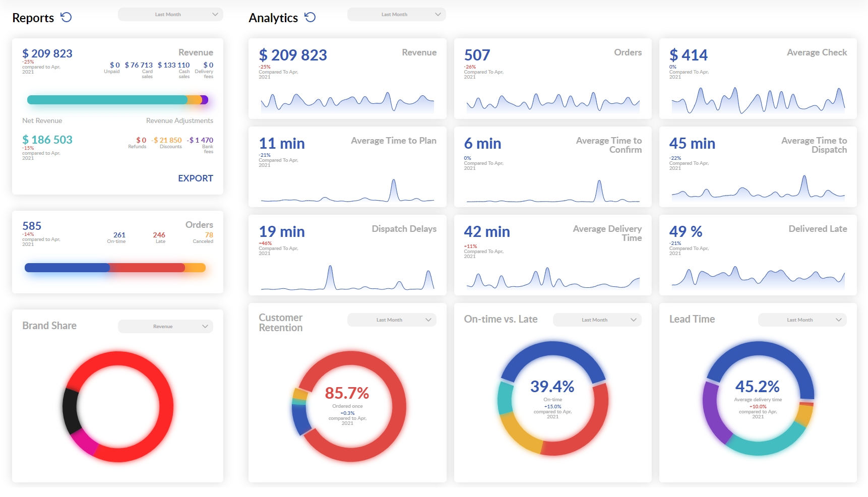
REPORTS: REVENUE TAB
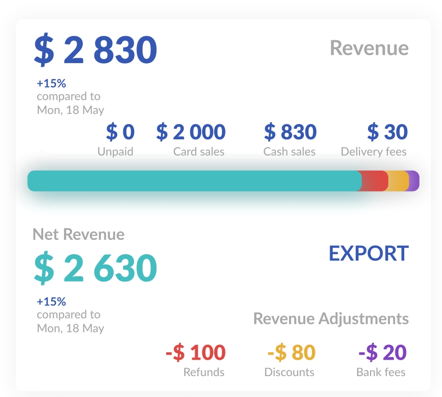
The Revenue tab in Reports shows current-day sales by default. You can select any other period to get a longer-range report. The sales are shown with the comparison percentage to the same day a week ago or, if you have selected another period, to a similar period in the past. The Revenue tab also shows if there are any unpaid orders and how much you get in cash and on your bank account for the orders paid with cards. The Revenue Adjustment tab shows the totals of Refunds, Discounts, and Bank fees and, as a result, your Net Revenue accompanied with a percentage comparison with a similar period. You can also export this data by clicking on the Export button. Kindly note that your user needs to have been assigned the Data Export Dashboard to be able to export any data.
REPORTS: ORDERS TAB
The orders tab shows you the number of orders processed with a breakdown of orders delivered on time and late alongside the number of canceled orders.

BRAND SHARE
Below the orders tab, there is the Brand Share circular diagram that shows the sales share of your brands/domains, if you have more than one. Click on any share to get more information on how each of your brands performs. Kindly note that clicking on a brand immediately updates information in all the Analytics tabs so they start to display the data for the selected brand only. You can revert back by clicking on the blank space outside the Brand Share diagram. Also, you can switch between Revenue and Orders modes in the dropdown list above the diagram. Additionally, you can switch between percentage mode and absolute numbers just by moving your mouse pointer inside the diagram.

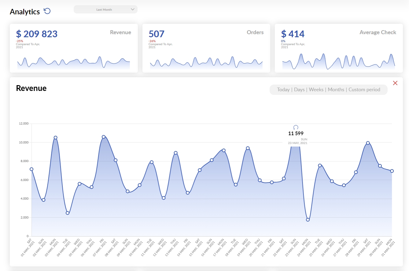
ANALYTICS: OVERVIEW
Analytics tabs show your business performance for today, however, you can select any other period from the dropdown menu. All the graphs are arranged in the card view with the real-time graphs in each, so you can start with an overview of your overall current performance then click on any graph card you need to enlarge it in order to get a more detailed view. Once a graph is enlarged, you can switch it to show data by hours (today), days, weeks, and months to get the necessary scale of the view.
Although all of the card names are self-explanatory, we would like to share some thoughts on how helpful they can be to improve the efficiency of your operations:
The Average check is the total number of your successful orders divided by the revenue. The changes in this indicator show you if there is any capacity to improve your upsales. Also, you can use the average-check indicator to make some important calculations for your business: for instance, you can derive the affordable Google ads cost per action (CPA).
The Average Time to Plan shows how long it takes for your kitchen to provide the Planned time for the operator. You have to take appropriate actions if this time is more than one minute.
The Average Time to Confirm shows how long it takes for the operator to confirm the order with the customer once the Planned time is provided by the kitchen. You have to take appropriate actions if this time is more than five minutes.
The Average Time to Dispatch shows how long it takes for the order to be dispatched from its confirmation to dispatching. You must take all possible measures to reduce this time as much as you can. Also, you might take a closer look at the graph if today’s Average Time to Dispatch exceeds your average to find out the causes and act accordingly to avoid them in future.
The Dispatch Delays graph shows how long it takes for the courier to take the ready-to-dispatch order to delivery. Although some orders may await couriers to arrive from the previous deliveries, you might have to revise the courier number and/or the algorithm they get their assignments if this time exceeds ten minutes.
The Average Delivery Time shows how long it takes to deliver an order on average for a selected period of time. The success of your efforts to optimize your delivery workflow can be measured by this indicator.
The Delivered Late percentage shows how many of your orders out of the total number of orders within the selected period were delivered late. These are shown on the graph so you can easily figure out the timeframe(s) when your kitchen’s and couriers’ workloads exceeded their capabilities to cook and deliver on time, so you can rearrange your couriers’ shifts accordingly. You can take a closer look at what causes delivery delays in the On-time vs Late circular diagram.
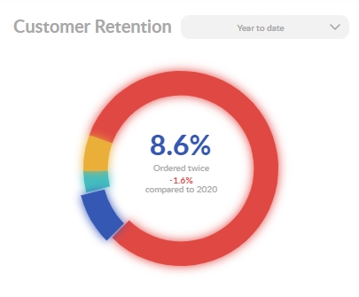
The Customer Retention circular diagram is the most important performance indicator. It shows how many of your customers ordered more than one time out of the total number of customers within the selected timeframe. It also shows the comparison to a similar timeframe in the past. Ideally, your actions towards maximizing customer satisfaction result in decreasing the percentage of those who have ordered once only and increasing the percentages of those who have ordered two or more times.
The On-time vs Late circular diagram provides you with a deeper insight into the reasons for being late within the selected timeframe:
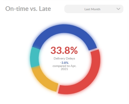
The Delivery Delays percentage shows the share of orders that failed to be delivered on time because the delivery took more time than expected.
The Kitchen Delays percentage shows the share of orders that failed to be prepared on time because the kitchen preparation time exceeded the planned one.
The Kitchen & Delivery Delays percentage shows the share of orders that failed both to be prepared and delivered on time.
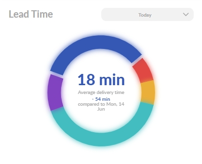
The Lead Time circular diagram describes your average order journey, showing the share of each workflow (order confirmation, preparation, assembling, and delivering). The diagram can show the absolute values in minutes as well if you move the mouse pointer inside it. Also, you can click outside the diagram to learn your overall lead time. Knowing these indicators will help your staff to plan the ETAs more precisely. Additionally, you can share information about your precise average lead time with your customers to gain more credibility. Of course, this will work only if your average lead time is really low and your real lead time in each case does not deviate much from average.
_____________________________
Next Step:
Exporting Data to Your ERP, Accounting, and Other Software
Previous Step:
Comments
0 comments
Please sign in to leave a comment.